 易网时代-编程资源站
易网时代-编程资源站
易网时代-编程资源站 
<?xml version="1.0" encoding="utf-8"?> <resources> <!-- 自定义属性开始 --><declare-styleable name="BorderTextView"> <attr name="layout_borders" format="boolean"></attr> <attr name="layout_borderLeft" format="boolean"></attr> <attr name="layout_borderTop" format="boolean"></attr> <attr name="layout_borderRight" format="boolean"></attr> <attr name="layout_borderBottom" format="boolean"></attr></declare-styleable><!-- 自定义属性结束 --></resources>其中需要说明的是,自定义属性文件的根节点页是<resources>,在根节点内创建你所需要的属性值,自定义属性的节点是以<declare-styleable>开始的,它表示的是个属性集可以包含众多属性,其中name="BorderTextView"是属性集名。接着在<declare-styleable>中定义我们需要的以<attr>为节点的属性,attr表示属性的意思name表示当前属性的名称,format表示的是属性值的类型,例如我们当前定义的属性类型为boolean类型,也就是说当前定义的属性取值只能为boolean类型的,format可以表示的的类型有好多种,最常见的如:string,boolean,integer,dimension,reference等这,里就不再详细讲解了,如果谁有疑问,可以自己动手问问度娘,她知道的比我多,呵呵
<?xml version="1.0" encoding="utf-8"?> <LinearLayoutxmlns:android="http://schemas.android.com/apk/res/android"xmlns:greendroid="http://schemas.android.com/apk/res/com.llew.e"android:orientation="vertical"android:layout_width="fill_parent"android:background="#ffffff"android:layout_height="fill_parent"><TextView android:layout_width="fill_parent" android:layout_height="wrap_content" android:layout_margin="10dip" android:text="@string/hello" android:textColor="#000000" /> <com.llew.e.view.wedgit.BorderTextView android:layout_width="wrap_content" android:layout_height="wrap_content" android:text="左侧带有边框" android:layout_margin="10dip" greendroid:layout_borderLeft="true" android:textSize="20sp" android:textColor="#aabbcc"></com.llew.e.view.wedgit.BorderTextView> <com.llew.e.view.wedgit.BorderTextView android:layout_width="wrap_content" android:layout_height="wrap_content" android:text="顶部带有边框" android:layout_margin="10dip" greendroid:layout_borderTop="true" android:textSize="20sp" android:textColor="#bbccaa"></com.llew.e.view.wedgit.BorderTextView><com.llew.e.view.wedgit.BorderTextView android:layout_width="wrap_content" android:layout_height="wrap_content" android:text="右侧带有边框" android:layout_margin="10dip" greendroid:layout_borderRight="true" android:textSize="20sp" android:textColor="#ccaabb"></com.llew.e.view.wedgit.BorderTextView><com.llew.e.view.wedgit.BorderTextView android:layout_width="wrap_content" android:layout_height="wrap_content" android:text="底部带有边框" android:layout_margin="10dip" greendroid:layout_borderBottom="true" android:textSize="20sp" android:textColor="#abcabc"></com.llew.e.view.wedgit.BorderTextView><com.llew.e.view.wedgit.BorderTextView android:layout_width="wrap_content" android:layout_height="wrap_content" android:text="四周带有边框" android:layout_margin="10dip" greendroid:layout_borders="true" android:textSize="20sp" android:textColor="#cbacba"></com.llew.e.view.wedgit.BorderTextView> </LinearLayout>使用自定义控件也很简单就是包名+自定义控件名,为了使用我们自定义的属性,必须在布局文件的根节点中加上xmlns:greendroid="http://schemas.android.com/apk/res/com.llew.e"这句话,其中xmlns:greendroid表示的是命名空间名称,greendroid只是个名字是我们使用自定义属性的前缀,可以随便取值(只要不是android就行了),com.llew.e是在manifest中的package的对应值,使用自定义属性就想代码中的那样:greendroid:layout_borderLeft="true",(*^__^*) 嘻嘻……,是不是可简单?
public class BorderTextView extends TextView { /** * 四周是否带有边框【true:四周带有边框】【false:四周不带边框】 */boolean borders = false;/** * 左边是否带有边框【true:左侧带有边框】【false:左侧不带边框】 */boolean borderLeft = false;/** * 顶部是否带有边框【true:顶部带有边框】【false:底部不带边框】 */boolean borderTop = false;/** * 右侧是否带有边框【true:右侧带有边框】【false:右侧不带边框】 */boolean borderRight = false;/** * 底部是否带有边框【true:底部带有边框】【false:底部不带边框】 */boolean borderBottom = false;/** * 边框颜色 */String textColor = "#ff000000"; public BorderTextView(Context context) { this(context, null);} public BorderTextView(Context context, AttributeSet attrs) { this(context, attrs, android.R.attr.textViewStyle);} public BorderTextView(Context context, AttributeSet attrs, int defStyle) { super(context, attrs, defStyle); // 获取自定义属性集 TypedArray typedArray = context.obtainStyledAttributes(attrs, R.styleable.BorderTextView); // 是否设置全部边框,默认为false borders = typedArray.getBoolean( R.styleable.BorderTextView_layout_borders, false); // 是否设置左侧边框,默认为false borderLeft = typedArray.getBoolean( R.styleable.BorderTextView_layout_borderLeft, false); // 是否设置顶部边框,默认为false borderTop = typedArray.getBoolean( R.styleable.BorderTextView_layout_borderTop, false); // 是否设置右侧边框,默认为false borderRight = typedArray.getBoolean( R.styleable.BorderTextView_layout_borderRight, false); // 是否设置底部边框,默认为false borderBottom = typedArray.getBoolean( R.styleable.BorderTextView_layout_borderBottom, false); // 获取文本颜色值,用来画边框的,便于和文本颜色匹配 textColor = attrs.getAttributeValue( "http://schemas.android.com/apk/res/android", "textColor"); typedArray.recycle();} @Overridepublic void draw(Canvas canvas) { super.draw(canvas); // 创建画笔 Paint paint = new Paint(); // 获取该画笔颜色 int color = paint.getColor(); // 设置画笔颜色 paint.setColor(Color.parseColor(textColor)); // 如果borders为true,表示左上右下都有边框 if (borders) {canvas.drawLine(0, 0, 0, this.getHeight() - 1, paint);canvas.drawLine(0, 0, this.getWidth() - 1, 0, paint);canvas.drawLine(this.getWidth() - 1, 0, this.getWidth() - 1,this.getHeight() - 1, paint);canvas.drawLine(0, this.getHeight() - 1, this.getWidth() - 1,this.getHeight() - 1, paint); } else {if (borderLeft) { // 画左边框线 canvas.drawLine(0, 0, 0, this.getHeight() - 1, paint);}if (borderTop) { // 画顶部边框线 canvas.drawLine(0, 0, this.getWidth() - 1, 0, paint);}if (borderRight) { // 画右侧边框线 canvas.drawLine(this.getWidth() - 1, 0, this.getWidth() - 1, this.getHeight() - 1, paint);}if (borderBottom) { // 画底部边框线 canvas.drawLine(0, this.getHeight() - 1, this.getWidth() - 1, this.getHeight() - 1, paint);} } // 设置画笔颜色归位 paint.setColor(color);} } 其实给BorderTextView添加边框也是很简单,原理就是其draw方法中绘画出边框罢,我们都知道每一个View控件在屏幕上显示出来大致可以归纳为三大步骤,首先调用View控件的onMesure方法,其次调用View控件的onLayout方法,再次调用View控件的onDraw方法,所以我们只需要在draw方法中绘制出边框就行了,绘制边框的步骤很简单,代码注释也很详细,就不再详细讲解了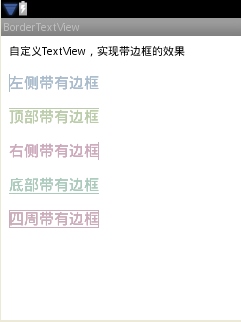
好了,今天的自定义属性实现带边框的TextView控件就讲解完了,谢谢大家的阅读。
源码下载:Android UI实现带下划线的文本框
以上就是本文的全部内容,希望对大家的学习有所帮助,也希望大家多多支持脚本之家。